Media Queries and Responsive Design

- Making Your Website Fit Like the Perfect Slice: Media Queries and the Art of Responsive Pizza Design
- What’s Cooking with Media Queries?
- The Perfect Recipe for Media Queries
- Serving Different Sizes: The Mobile-First Approach
- Flipping the Pizza: Handling Different Orientations
- Finding the Right Slice: Creating Breakpoints Wisely
- Wrapping It Up with a Slice to Go
Making Your Website Fit Like the Perfect Slice: Media Queries and the Art of Responsive Pizza Design
Imagine if your favorite pizza could magically resize itself to fit perfectly onto any plate, from a tiny saucer to a massive platter. That’s exactly what media queries do for your website, ensuring it looks delicious on any device! Let’s dive into the saucy world of media queries, using our scrumptious pizza website as the perfect topping for learning responsive web design.
What’s Cooking with Media Queries?
Media queries are the secret recipe behind responsive design. They’re like the kitchen gadgets that help you slice, dice, and serve your website in the best possible way, no matter the screen size. Think of media queries as the culinary wizards that ask, “Is this a small plate (phone) or a big platter (desktop)?” and adjust your website’s serving size accordingly.
The Perfect Recipe for Media Queries
To complement the playful and instructive content on using media queries for a responsive pizza-themed website, let’s create an HTML file that integrates with the provided CSS styles. This HTML file will include a simple structure to demonstrate how the media queries adjust the layout and appearance for different device sizes, focusing on a pizza menu and a gallery of pizza images as examples.
<!-- file: "index.html" -->
<!DOCTYPE html>
<html lang="en">
<head>
  <meta charset="UTF-8">
  <meta name="viewport" content="width=device-width, initial-scale=1.0">
  <title>The Responsive Pizza Parlor</title>
  <link rel="stylesheet" href="styles.css">
</head>
<body>
  <div class="container">
    <header>
      <h1>Welcome to The Responsive Pizza Parlor</h1>
    </header>
    <section class="pizza-menu">
      <h2>Our Delicious Pizza Menu</h2>
      <p>Explore our mouth-watering pizza options, perfect for any taste and size. From the classic Margherita to our adventurous Hawaiian surprise, there's a slice for everyone!</p>
    </section>
    <section class="pizza-gallery-section">
      <h2>Pizza Gallery</h2>
      <div class="pizza-gallery">
        <img src="pizza1.jpg" alt="Classic Margherita">
        <img src="pizza2.jpg" alt="Pepperoni Pizza">
        <img src="pizza3.jpg" alt="Vegetarian Pizza">
      </div>
    </section>
    <footer>
      <p>Made with love by The Responsive Pizza Parlor Team</p>
    </footer>
  </div>
</body>
</html>
This basic HTML structure includes:
- A header with the title of the website.
- A section for the pizza menu with a brief introduction.
- A pizza gallery section showcasing different pizza images. (Note: Replace “pizza1.jpg”, “pizza2.jpg”, and “pizza3.jpg” with actual paths to your images or online sources.)
- A footer with a custom message.
Please ensure you update the image sources to point to actual images you have access to, and adjust the CSS file name in the tag if your stylesheet is named differently. This setup provides a simple yet effective demonstration of how responsive design can be applied to a thematic website using media queries.
/* file: "styles.css" */
body {
  font-family: Arial, sans-serif;
  margin: 0;
  padding: 0;
  background-color: wheat; /* Light background to evoke a warm, pizza dough color */
}

.container {
  padding: 20px;
}

.pizza-menu {
  background: tomato;
  color: white;
  padding: 20px;
  margin-bottom: 20px;
  border-radius: 8px;
}

.pizza-gallery {
  display: block;
}

.pizza-gallery img {
  width: 250px;
  margin: 20px;
  border-radius: 8px;
  height: 250px;
}
Here’s a taste of how you can use media queries to ensure your pizza website looks great, whether it’s being viewed on a phone, tablet, or desktop:
@media only screen and (max-width: 600px) {
  .pizza-menu {
    font-size: 12px;
  }
}
In this snippet, we’re making the pizza menu text smaller on devices with screens less than 600px wide. It’s like choosing a smaller font for a side salad instead of a full-sized pizza.
Serving Different Sizes: The Mobile-First Approach
When cooking up a responsive design, it’s best to start with the mobile version first. It’s like preparing a personal pizza before tackling a family-sized one. This way, you ensure that your site is fully edible on the smallest screens, and then you can add more toppings as the screen size increases.
For our pizza website, we’ll start simple:
/* Base toppings for mobile devices */
.pizza-menu {
  background: tomato;
  color: mozzarella;
}

/* Extra toppings for tablets */
@media screen and (min-width: 768px) {
  .pizza-menu {
    background: tomato;
    color: mozzarella;
    border-left: 5px solid basil;
  }
}

/* Full feast for desktops */
@media screen and (min-width: 1024px) {
  .pizza-menu {
    background: tomato;
    color: mozzarella;
    border-left: 10px solid basil;
    box-shadow: 0 4px 8px rgba(0,0,0,0.2);
  }
}
Click here to view the css file with the new changes
/* file: "styles.css" */
body {
  font-family: Arial, sans-serif;
  margin: 0;
  padding: 0;
  background-color: #fffbea; /* Light background to evoke a warm, pizza dough color */
}

.container {
  padding: 20px;
}

.pizza-menu {
  background: tomato;
  color: wheat;
  padding: 20px;
  margin-bottom: 20px;
  border-radius: 8px;
}

.pizza-gallery {
  display: block;
}

.pizza-gallery img {
  width: 250px;
  margin: 20px;
  border-radius: 8px;
  height: 250px;
}

@media only screen and (max-width: 600px) {
  .pizza-menu {
    font-size: 12px;
  }
}

@media screen and (min-width: 768px) {
  .pizza-menu {
    border-left: 5px solid olive;
  }
}

@media screen and (min-width: 1024px) {
  .pizza-menu {
    border-left: 10px solid olive;
    box-shadow: 0 4px 8px rgba(0,0,0,0.2);
  }
}
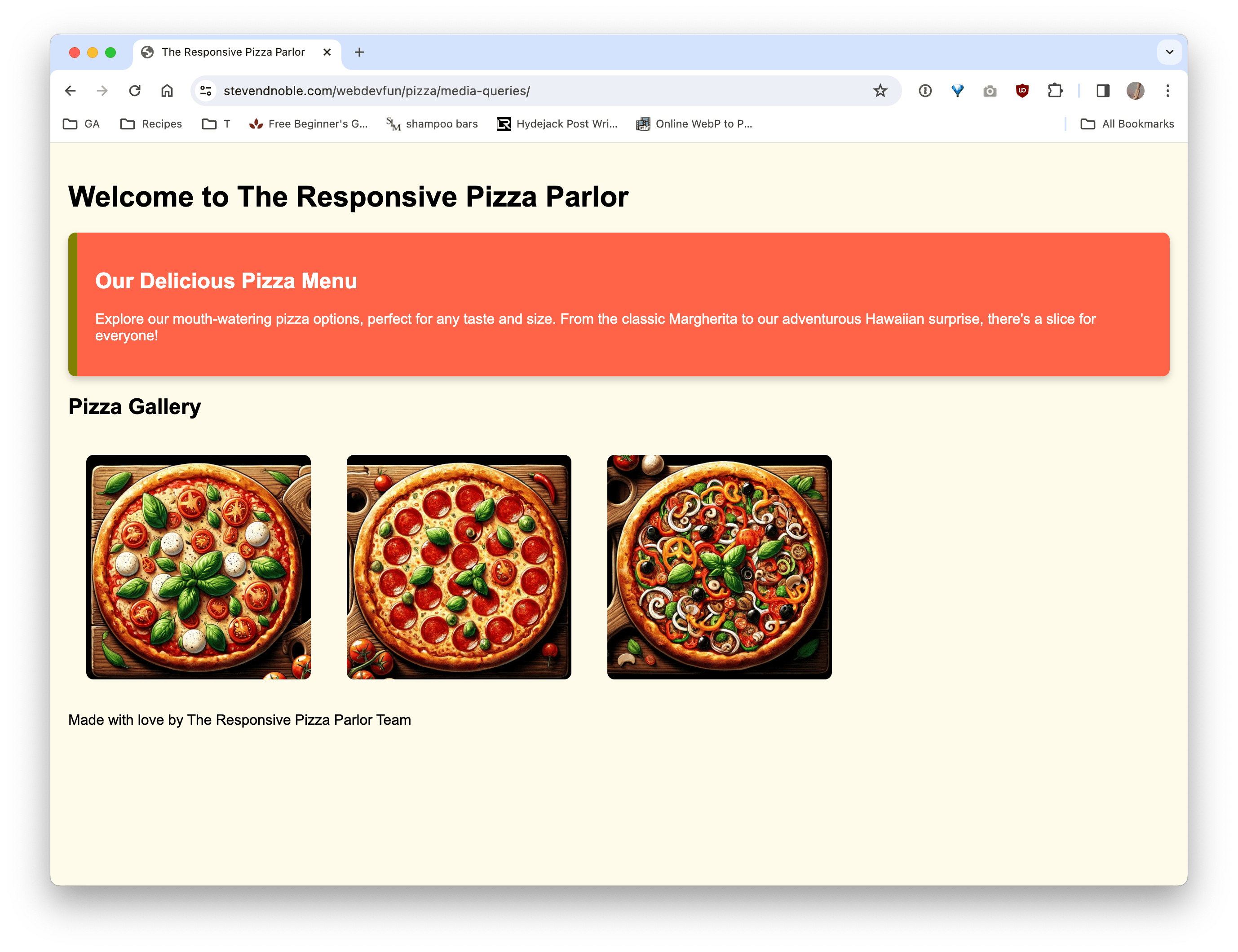
Here is how our page looks. Click on the link and adjust the screen sizes to see it on mobile, tablet, and desktop sizes:

Flipping the Pizza: Handling Different Orientations
Just like how a pizza can be rotated but still tastes amazing, media queries help your website look good in both portrait and landscape modes. Maybe you want to rearrange toppings when someone flips their device:
@media screen and (orientation: landscape) {
  .pizza-gallery {
    display: flex;
  }
}
Now, your pizza photos line up side by side, like slices ready for sharing, when the device is turned sideways.
Finding the Right Slice: Creating Breakpoints Wisely
Setting breakpoints in your media queries is like deciding how to slice your pizza. You wouldn’t cut a small pizza into 12 slices, right? Observe how your website’s content behaves as you resize your browser. Add breakpoints where the design starts to feel cramped, like when your toppings are spilling over the edge of the crust.
Wrapping It Up with a Slice to Go
Media queries are your best friends in the kitchen of web design, ensuring your site is as responsive and versatile as pizza itself. By adjusting your recipe based on the device (or plate) size, you make sure that everyone gets the perfect slice, whether they’re on the go or sitting down for a feast. So go ahead, sprinkle some media queries onto your pizza website, and watch as it transforms into a mouth-watering masterpiece that’s ready for any screen size!
Happy designing, and remember: in the world of responsive design, every day is pizza day!
