Web Accessibility

- Exploring the Fundamentals of Web Accessibility: Ensuring Everyone Gets a Slice of the Web
- The Crust: Understanding Web Accessibility
- The Sauce: The Importance of Web Accessibility
- The Toppings: Key Principles of Web Accessibility
- The Cheese: Implementing Web Accessibility
- The Oven: Baking It All Together
- Key Accessibility Enhancements:
- The Final Slice: Why Web Accessibility Matters
Exploring the Fundamentals of Web Accessibility: Ensuring Everyone Gets a Slice of the Web
In the vast and ever-expanding digital pizzeria that is the internet, web accessibility ensures that everyone, including people with disabilities, can order their favorite slice without hindrance. Just as a pizzeria might have ramps for wheelchairs and menus in Braille for the visually impaired, web accessibility involves designing and developing websites and applications that are usable for people with a wide range of abilities. This blog post kneads into the dough of web accessibility, breaking down its key ingredients, and serving up actionable tips to make your website deliciously accessible to all.
The Crust: Understanding Web Accessibility
Web accessibility is the inclusive practice of removing barriers that prevent interaction with, or access to, websites by people with disabilities. When websites are correctly designed, developed, and edited, all users have equal access to information and functionality. Think of web accessibility as the crust of your pizza; it’s the base upon which you build everything else. Without a good crust, the pizza won’t hold up, no matter how great the toppings are.
The Sauce: The Importance of Web Accessibility
The importance of web accessibility cannot be overstated. It’s not just about compliance with laws and regulations (though that is certainly a critical part of it); it’s about creating an inclusive digital world. Accessibility boosts your SEO, reaches a wider audience, improves user experience, and demonstrates social responsibility. Much like the sauce that adds depth and flavor to your pizza, web accessibility enriches the web, making it more enjoyable and usable for everyone.
The Toppings: Key Principles of Web Accessibility
The Web Content Accessibility Guidelines (WCAG) serve as the primary standards for web accessibility, outlining how to make web content more accessible to people with disabilities. These guidelines are organized around four principles, often remembered by the acronym POUR:
Perceivable: Information and user interface components must be presentable to users in ways they can perceive. This might mean providing text alternatives for non-text content or creating content that can be presented in different ways without losing meaning.
Operable: User interface components and navigation must be operable. This involves making all functionality available from a keyboard and giving users enough time to read and use content.
Understandable: Information and the operation of the user interface must be understandable. This means making text readable and predictable and ensuring that websites appear and operate in predictable ways.
Robust: Content must be robust enough that it can be interpreted by a wide variety of user agents, including assistive technologies. This involves maximizing compatibility with current and future user tools.
The Cheese: Implementing Web Accessibility
Implementing web accessibility can seem daunting, but like spreading cheese on a pizza, it’s about covering all areas evenly. Here are some practical tips to get started:
Use Semantic HTML: Proper use of HTML elements ensures that the structure of your web content is meaningful both visually and programmatically.
Ensure Sufficient Contrast: Text and background colors should have sufficient contrast to be readable by users with low vision.
Keyboard Navigation: Ensure that all interactive elements are operable through keyboard-only navigation.
Alt Text for Images: Provide alternative text for images so screen readers can describe them to users who can’t see them.
Accessible Forms: Label form elements properly so users understand what input is required.
Test Your Site: Use accessibility testing tools and involve people with disabilities in testing to gather real-world insights into the usability of your site.
The Oven: Baking It All Together
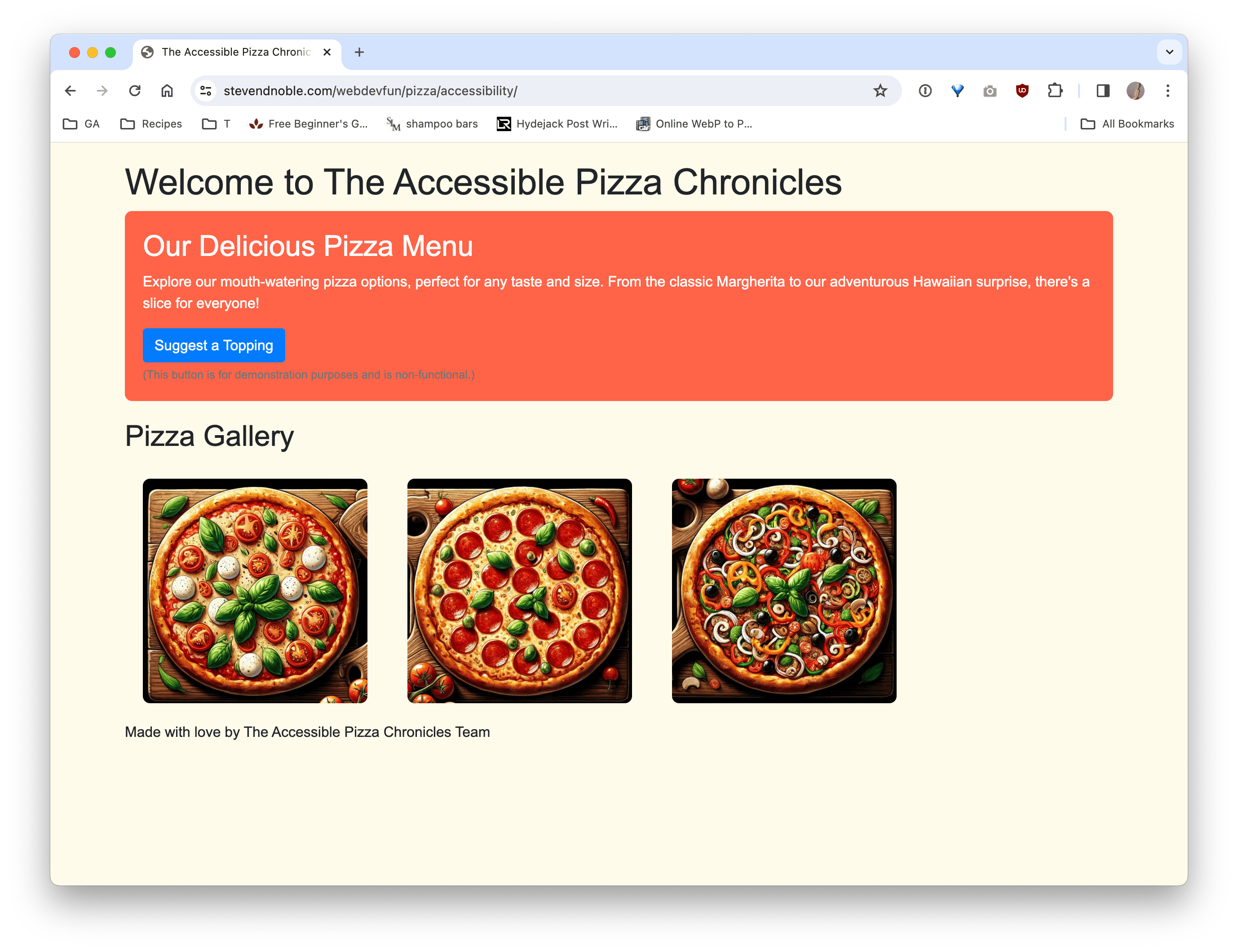
To enhance the pizza-themed HTML page with web accessibility features, we’ll implement several key improvements. These changes aim to ensure the page is more accessible to users with disabilities, including those who rely on screen readers or keyboard navigation. Below is an updated version of the pizza HTML page incorporating these accessibility features:
<!-- file: "index.html" -->
<!DOCTYPE html>
<html lang="en">
<head>
  <meta charset="UTF-8">
  <meta name="viewport" content="width=device-width, initial-scale=1.0">
  <title>The Accessible Pizza Chronicles</title>
  <link rel="stylesheet" href="https://stackpath.bootstrapcdn.com/bootstrap/4.5.2/css/bootstrap.min.css">
  <link rel="stylesheet" href="styles.css">
</head>
<body>
  <div class="container">
      <header>
        <h1 tabindex="0">Welcome to The Accessible Pizza Chronicles</h1>
      </header>
      <main>
        <section aria-labelledby="menu-heading" class="pizza-menu">
          <h2 id="menu-heading" tabindex="0">Our Delicious Pizza Menu</h2>
          <p tabindex="0">Explore our mouth-watering pizza options, perfect for any taste and size. From the classic Margherita to our adventurous Hawaiian surprise, there's a slice for everyone!</p>
          <button type="button" class="btn btn-primary" onclick="alert('This is a non-functional demo button.');">Suggest a Topping</button>
          <small class="form-text text-muted">(This button is for demonstration purposes and is non-functional.)</small>
        </section>
        <section aria-labelledby="gallery-heading">
          <h2 id="gallery-heading" tabindex="0">Pizza Gallery</h2>
          <div class="pizza-gallery">
            <img src="margherita.jpg" alt="A delicious Margherita pizza" tabindex="0">
            <img src="pepperoni.jpg" alt="A spicy Pepperoni pizza" tabindex="0">
            <img src="vegetarian.jpg" alt="A fresh Vegetarian pizza loaded with vegetables" tabindex="0">
          </div>
        </section>
      </main>
      <footer tabindex="0">
        <p>Made with love by The Accessible Pizza Chronicles Team</p>
      </footer>
  </div>
  <script src="https://code.jquery.com/jquery-3.5.1.slim.min.js"></script>
  <script src="https://cdn.jsdelivr.net/npm/@popperjs/core@2.5.2/dist/umd/popper.min.js"></script>
  <script src="https://stackpath.bootstrapcdn.com/bootstrap/4.5.2/js/bootstrap.min.js"></script>
</body>
</html>

Key Accessibility Enhancements:
Language Specification: The lang attribute in the <html> tag specifies the primary language of the page, aiding screen readers in pronunciation.
Tab Index: The tabindex=”0” attribute has been added to major sections and interactive elements, ensuring that they are included in the keyboard navigation sequence.
ARIA Landmarks: The use of aria-labelledby attributes for sections provides screen readers with more context about the content that follows. This enhances the semantic structure of the content, making it easier for users with assistive technologies to navigate.
Alternative Text for Images: The alt attribute provides descriptive text for images, allowing screen reader users to understand the content of the images.
Descriptive Button and Link Text: The button includes a clear, descriptive action, which is crucial for screen reader users to understand its purpose without needing additional context.
Non-Functional Button Disclaimer: A small disclaimer has been added beneath the demo button to inform users that it is non-functional, preventing any confusion.
By incorporating these accessibility features, the pizza-themed HTML page not only becomes more inclusive but also aligns better with web standards and best practices for accessible web design.
The Final Slice: Why Web Accessibility Matters
Creating an accessible web is akin to preparing a pizza that everyone can enjoy, regardless of dietary restrictions or personal preferences. It’s about ensuring that no one is left out and that the digital world is as diverse and inclusive as the physical one. By embedding accessibility into the core of your web design and development processes, you make a commitment to inclusivity and open up your slice of the web to the entire world.
As we continue to push the boundaries of digital innovation, let’s remember that technology is at its best when it brings people together. Let’s make the web a place where everyone has a seat at the table, and every order is welcome.
